
Mobile-friendly websites: a small business guide for 2026

Over 60% of web traffic now comes from mobile devices, yet many small business owners assume passing a basic mobile test means their site is optimized. That’s a costly misconception. In 2026, mobile friendliness goes far beyond responsive layouts. It demands strategic content parity, lightning-fast Core Web Vitals, and intuitive usability that converts visitors into customers. This guide reveals exactly how to build a mobile presence that dominates search rankings and drives real business growth.
Table of Contents
- Why Mobile Friendly Websites Matter For Small Businesses In 2026
- Responsive Design And Content Parity: Core Principles For Mobile Optimization
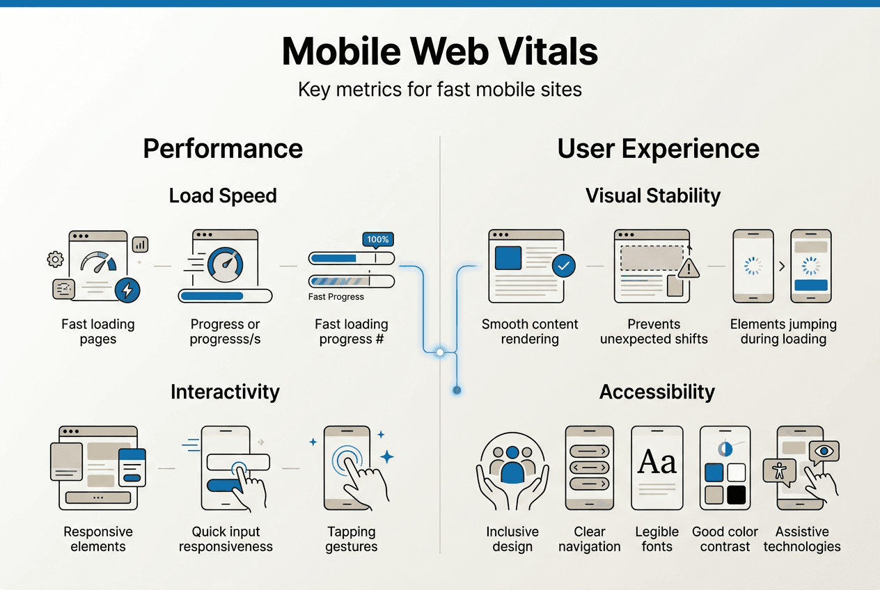
- Optimizing Mobile Site Performance With Core Web Vitals
- Driving Engagement And Conversions With Mobile Usability And Branding
- Boost Your Mobile Presence With Expert Web Solutions
- Frequently Asked Questions
Key takeaways
| Point | Details |
|---|---|
| Mobile traffic dominates | Over 60% of all web visits happen on mobile devices, making mobile optimization essential for reaching your audience. |
| Mobile-first indexing rules | Google ranks sites based on their mobile version, so poor mobile performance directly hurts your search visibility. |
| Core Web Vitals drive rankings | Metrics like loading speed and layout stability are critical ranking factors that impact user experience and SEO. |
| Responsive design boosts conversions | Properly optimized mobile sites increase conversion rates by 20-30% through improved usability and trust signals. |
| Content parity matters | Maintaining identical content, metadata, and structured data across mobile and desktop versions protects your rankings. |
Why mobile friendly websites matter for small businesses in 2026
The shift to mobile browsing isn’t coming. It’s already here, and it’s reshaping how customers find and evaluate businesses online. More than 60% of web traffic originates from smartphones and tablets, meaning the majority of your potential customers are experiencing your brand on a small screen first. If your site doesn’t deliver a seamless mobile experience, you’re losing visitors before they even see what you offer.
Google’s mobile-first indexing changed the game permanently. The search giant now uses your mobile site as the primary version for ranking and indexing, making mobile performance a direct factor in where you appear in search results. Your desktop site could be perfect, but if your mobile version is slow, clunky, or missing critical content, your rankings suffer across all devices.
Small businesses face unique challenges in this mobile-first world. You’re competing against larger companies with dedicated web teams, yet your customers expect the same frictionless experience. The good news? Mobile optimization levels the playing field. A fast, intuitive mobile site can outrank competitors who neglect this crucial element, giving you visibility exactly when local customers are searching for solutions.
The consequences of ignoring mobile optimization are severe:
- Lost search visibility as Google prioritizes mobile-optimized competitors
- Higher bounce rates when visitors encounter slow loading or confusing navigation
- Missed conversions from frustrated users who abandon your site for easier alternatives
- Damaged brand perception when your mobile experience feels outdated or unprofessional
Consider this reality check from industry data:
Mobile-first indexing means your mobile site performance directly impacts search rankings, user engagement, and ultimately your bottom line revenue.
For small business owners, the message is clear. Mobile optimization isn’t a nice-to-have feature or a future project. It’s the foundation of your digital presence in 2026. Every day you delay improving your mobile experience is a day you’re handing potential customers to competitors who understand this shift. The businesses thriving today are those treating mobile as their primary platform, not an afterthought. Our mobile SEO guide explores advanced strategies to maximize your mobile search performance.
Responsive design and content parity: core principles for mobile optimization
Responsive web design represents the gold standard for mobile optimization, but many business owners misunderstand what it actually means. RWD isn’t just about shrinking your desktop site to fit smaller screens. It’s about creating a fluid experience that adapts intelligently to different devices, screen sizes, and user behaviors. Your layout, images, and interactive elements should automatically adjust to provide optimal usability whether someone visits on a phone, tablet, or desktop.
The technical approach matters significantly. Responsive design uses flexible grids and CSS media queries to create one codebase that serves all devices. This differs from older adaptive approaches that served separate versions based on device detection. Responsive is more maintainable, more reliable, and exactly what search engines prefer.

| Approach | How It Works | Key Benefits | Best For |
|---|---|---|---|
| Responsive Design | Single flexible layout adapts fluidly to any screen size using CSS | Easier maintenance, better SEO, consistent user experience | Most small businesses, content-heavy sites |
| Adaptive Design | Multiple fixed layouts switch based on detected device breakpoints | More control over specific device experiences | Complex applications with device-specific features |
| Mobile-Separate | Completely different mobile site (m.domain.com) | Maximum customization for mobile users | Large enterprises with resources for dual maintenance |
Content parity is where many businesses unknowingly sabotage their SEO efforts. Google expects your mobile and desktop versions to contain identical core content, including headings, body text, metadata, and structured data. When your mobile site hides content behind accordions, removes sections to save space, or uses different headings, you’re sending conflicting signals to search engines. The result? Lower rankings because Google can’t determine which version represents your true content.
Common content parity mistakes include:
- Removing detailed product descriptions on mobile to reduce scrolling
- Using abbreviated headings or different keyword targeting on mobile pages
- Hiding important sections like testimonials or FAQs in mobile menus
- Implementing different schema markup or metadata across versions
- Serving lighter image galleries that remove key visual information
These decisions might seem logical for mobile usability, but they create a mismatch that confuses search algorithms. Instead, focus on presenting the same comprehensive content with better mobile formatting. Use collapsible sections that keep content accessible, optimize images for mobile without removing them, and ensure every important element appears on both versions.
Pro Tip: Conduct a monthly content audit by comparing your mobile and desktop versions side by side. Check that all headings match exactly, metadata is identical, and no substantial content disappears on mobile. Use Chrome DevTools to toggle between device views and catch discrepancies before they impact rankings.
Our responsive web design services ensure your site maintains perfect content parity while delivering exceptional mobile experiences. The investment in proper responsive architecture pays dividends through improved rankings, better user engagement, and simplified site maintenance.
Optimizing mobile site performance with Core Web Vitals
Core Web Vitals transformed mobile SEO from a vague concept into measurable benchmarks that directly influence your search rankings. These three metrics quantify user experience in ways that correlate strongly with engagement and conversions. Google made them official ranking factors, meaning your mobile site’s technical performance now carries the same weight as your content quality and backlink profile.
Understanding each metric helps you prioritize improvements:
| Metric | What It Measures | Target Score | Mobile SEO Impact |
|---|---|---|---|
| Largest Contentful Paint (LCP) | Time until main content becomes visible | Under 2.5 seconds | Poor LCP signals slow loading, increasing bounce rates and lowering rankings |
| First Input Delay (FID) | Responsiveness to first user interaction | Under 100 milliseconds | High FID frustrates users trying to click or tap, damaging engagement metrics |
| Cumulative Layout Shift (CLS) | Visual stability during page load | Under 0.1 | Unexpected layout shifts cause misclicks and poor user experience |
The real-world impact of optimizing these metrics is dramatic. One B2B platform saw their average search position improve from 41.8 to 14.5 after addressing Core Web Vitals issues, tripling their organic visibility. That’s not a minor ranking bump. That’s the difference between obscurity and page one dominance.
Here’s your systematic approach to improving Core Web Vitals for mobile:
- Run a baseline audit using Google PageSpeed Insights or Lighthouse to identify your current scores and specific problem areas.
- Optimize images by compressing files, using modern formats like WebP, and implementing responsive image sizing with srcset attributes.
- Minimize JavaScript execution by removing unused code, deferring non-critical scripts, and breaking large bundles into smaller chunks.
- Implement lazy loading for images and videos below the fold so they only load when users scroll near them.
- Eliminate render-blocking resources by inlining critical CSS and deferring non-essential stylesheets.
- Reserve space for ad slots, embeds, and dynamic content to prevent layout shifts as elements load.
- Use a content delivery network to serve assets from servers geographically closer to your users.
- Enable browser caching so returning visitors load your site faster on subsequent visits.
Pro Tip: Focus on LCP first since it typically has the biggest impact on user perception. Lazy loading images below the fold while prioritizing above-the-fold content creates immediate improvements. Then tackle CLS by setting explicit width and height attributes on all images and embeds.
Mobile users are particularly sensitive to performance issues because they’re often on slower connections or using devices with limited processing power. A site that loads acceptably on desktop can feel painfully slow on mobile, creating a disconnect between your intended experience and reality.
Optimizing Core Web Vitals isn’t just about appeasing Google’s algorithm. It’s about respecting your visitors’ time and delivering the fast, stable experience they expect from professional businesses in 2026.
Our Core Web Vitals optimization services combine technical audits with strategic improvements that boost both rankings and user satisfaction. The businesses winning mobile search today are those treating performance as a competitive advantage, not a technical afterthought.
Driving engagement and conversions with mobile usability and branding
Technical optimization gets visitors to your mobile site, but usability and branding determine whether they convert into customers. The data tells a compelling story: businesses implementing responsive design see conversion rates increase by 20 to 30 percent simply by removing friction from the mobile experience. That’s not about changing your offer or pricing. That’s pure usability gains translating directly to revenue.
Mobile users operate in a different mindset than desktop browsers. They’re often multitasking, dealing with distractions, or making quick decisions on the go. Your mobile site needs to accommodate this reality with streamlined navigation, prominent calls to action, and trust signals positioned exactly where hesitation occurs.
Essential mobile usability elements include:
- Thumb-friendly navigation with tap targets at least 48×48 pixels to prevent misclicks
- Simplified forms that minimize typing and use mobile-appropriate input types
- Prominent phone and location buttons for immediate contact on local business sites
- Sticky headers or floating action buttons that keep conversion paths visible while scrolling
- Clear visual hierarchy that guides attention to your most important content first
- Fast-loading trust signals like security badges, reviews, and guarantees above the fold
Branding consistency across mobile experiences builds the credibility that converts browsers into buyers. A workwear company achieved a 389% conversion increase by strengthening their brand presentation and removing usability friction. They didn’t change their products or prices. They simply made it easier for mobile visitors to trust them and complete purchases.
Your mobile branding strategy should reinforce these trust elements:
- Consistent logo placement and color scheme that matches your desktop presence
- Professional product photography optimized for mobile viewing without quality loss
- Customer testimonials and reviews strategically placed near decision points
- Clear return policies and guarantees that address common purchase objections
- Visible contact information and business credentials that verify legitimacy
Pro Tip: Place your strongest trust signals (customer count, years in business, money-back guarantee) immediately below your primary call to action. Mobile users make faster decisions, so reducing hesitation at the exact moment of conversion dramatically improves completion rates.
The mobile shopping experience demands special attention to checkout optimization. Every additional form field or unnecessary step increases abandonment rates exponentially on mobile devices. Consider implementing guest checkout, auto-fill capabilities, and mobile wallet integration to minimize friction. The easier you make it to buy, the more people will complete transactions.
Our UI/UX design services focus specifically on creating mobile experiences that convert. We’ve helped clients like those in our portfolio achieve measurable improvements in engagement and revenue by applying these usability and branding principles systematically.
Remember that mobile optimization is an ongoing process, not a one-time project. User behavior evolves, technology advances, and competitive standards rise continuously. The businesses maintaining strong mobile performance in 2026 are those treating it as a core business priority deserving regular attention and investment.
Boost your mobile presence with expert web solutions
Transforming your mobile presence from adequate to exceptional requires specialized expertise in responsive design, performance optimization, and conversion-focused user experience. At Invisio Solutions, we’ve helped businesses across industries create mobile sites that don’t just look good but deliver measurable results in search rankings and revenue growth.

Our responsive web design services combine technical excellence with strategic thinking to build sites that perform flawlessly across all devices. We’ve guided clients through complete mobile transformations, like our work with Affinity UA, where thoughtful design and optimization created significant improvements in user engagement and business outcomes.
Whether you need a complete mobile redesign or targeted improvements to your existing site, our UI/UX design team brings the expertise to make it happen. Let’s build a mobile presence that turns your website into your most effective business development tool.
Frequently asked questions
What is the difference between mobile friendly and responsive websites?
Mobile friendly means your site is usable on mobile devices, but responsive design goes further by creating a fluid layout that adapts intelligently to any screen size. Responsive sites use flexible grids and CSS to provide optimal experiences across all devices with a single codebase, while basic mobile friendly sites might just be readable on phones without true optimization.
How often should I test my site for mobile SEO performance?
Conduct comprehensive mobile audits quarterly to catch performance degradation, but monitor Core Web Vitals monthly using Google Search Console. Run quick mobile usability tests after any site updates or content additions. Regular testing prevents small issues from becoming ranking problems.
Can a mobile friendly site alone guarantee top Google rankings?
No, mobile optimization is essential but not sufficient for top rankings. You still need quality content, relevant keywords, authoritative backlinks, and strong technical SEO. Mobile friendliness is a qualifying factor that prevents ranking penalties, while other elements drive you to the top positions.
What are simple steps to improve mobile loading speed?
Compress and optimize all images, enable browser caching, minimize JavaScript and CSS files, implement lazy loading for below-the-fold content, and use a content delivery network. These changes typically improve loading speed by 30 to 50 percent without requiring major site rebuilds.
How does mobile usability affect customer trust and conversions?
Poor mobile usability signals unprofessionalism and creates friction that breaks buying momentum. Sites with intuitive navigation, fast loading, and clear trust signals convert 20 to 30 percent better because they reduce hesitation at critical decision points. Mobile users judge business credibility partly by website quality, making usability a direct trust factor.
Recommended
- Choose The Best Website Development Company Near Me In 2026
- Choose The Best Website Development Company Near Me In 2026
- Which Is Better For Guide To Mobile Websites Vs. Mobile Apps
- Mobile SEO Guide: Optimize For Mobile-First Success
- Build your MVP fast without coding: 2026 founder guide | HK
- Mobile-friendly website tips to boost your business in 2026 | Ibrandmedia