How to design a logo that builds your brand identity
![]()
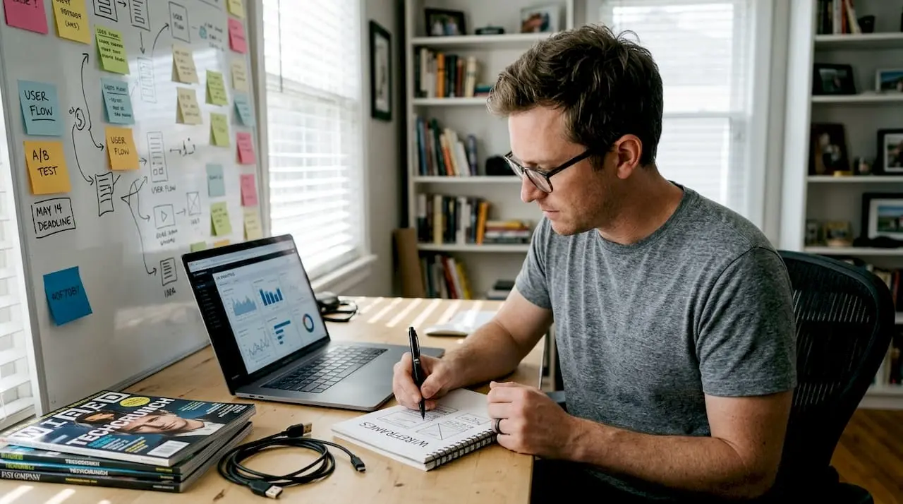
Designing a logo that truly represents your brand can feel overwhelming for small business owners. You know your logo needs to capture your business identity, attract customers, and work across every platform, but where do you start? Many entrepreneurs struggle with choosing colors, fonts, and symbols that communicate their brand values effectively. This guide walks you through the entire logo design process step by step, from understanding your brand to finalizing a polished design that strengthens your online presence and builds lasting customer recognition.
Table of Contents
- Key takeaways
- Preparing to design your logo: understanding your brand and gathering tools
- Step-by-step execution: designing your logo from concept to draft
- Common mistakes in logo design and how to avoid them
- Finalizing and verifying your logo design
- How Invisio Solutions can help with your logo and brand identity
- Frequently asked questions
Key Takeaways
| Point | Details |
|---|---|
| Understand brand first | Before sketching, define your brand mission, audience, and what sets you apart to guide design decisions. |
| Do thorough research | Study competitors and market to differentiate your logo and ensure it fits your industry and audience. |
| Use vector tools | Work with vector software like Illustrator or Inkscape so logos scale cleanly across sizes and platforms. |
| Apply design principles | Keep logos simple, versatile, relevant, timeless, and memorable to maximize impact. |
| Iterate and test | Create multiple concepts, sketch on paper, then refine top ideas through digital iterations and feedback. |
Preparing to design your logo: understanding your brand and gathering tools
Before you sketch a single shape or choose a color, you need crystal-clear understanding of what your brand represents. Your logo isn’t just a pretty picture. It’s a visual shortcut to your business values, personality, and promise to customers. Start by defining your brand’s mission in one sentence. What problem do you solve? Who do you serve? What makes you different?
Next, identify your target audience with specificity. Are you reaching busy parents, tech-savvy millennials, or traditional business owners? Your audience’s preferences should influence every design choice. A playful, colorful logo might work perfectly for a children’s toy company but fail miserably for a law firm. Research your competitors thoroughly. Visit their websites, study their logos, and note what works and what doesn’t. This research helps you differentiate your brand and avoid looking like everyone else in your industry.
Successful logos start with a clear brand understanding and research, which is why professional branding and identity design services emphasize this foundation. Gather your design tools next. You’ll need design software like Adobe Illustrator, Affinity Designer, or free options like Inkscape for vector graphics. Vector files scale infinitely without losing quality, which is essential for logos. Keep sketchpads handy for initial brainstorming. Sometimes the best ideas come from quick pencil sketches before you touch a computer.
Create a mood board with colors, fonts, and images that capture your brand’s feel. This visual reference keeps your design focused and consistent. Understanding key design principles is equally important:
- Simplicity: The most memorable logos are clean and uncluttered
- Versatility: Your logo must work in color and black and white, large and small
- Relevance: Design choices should connect to your industry and audience
- Timelessness: Avoid trendy elements that will look dated quickly
- Memorability: Distinctive shapes and clever concepts stick in people’s minds
Pro Tip: Create a simple brand style guide document before designing. Include your mission statement, target audience description, three to five brand personality words, and your color palette with hex codes. This document becomes your north star throughout the design process and ensures consistency.
| Design Tool | Best For | Cost |
|---|---|---|
| Adobe Illustrator | Professional vector design with advanced features | Subscription |
| Affinity Designer | One-time purchase alternative with robust features | One-time |
| Inkscape | Free vector design for beginners | Free |
| Canva | Quick designs with templates | Free/Premium |
Step-by-step execution: designing your logo from concept to draft
With your preparation complete, it’s time to create. Start by sketching at least 10 to 15 different logo concepts on paper. Don’t judge or filter ideas at this stage. Let your creativity flow freely. Some ideas will be terrible, and that’s perfectly fine. You’re exploring possibilities and discovering unexpected directions. Focus on different approaches: wordmarks using stylized text, lettermarks using initials, pictorial marks with recognizable images, abstract symbols, mascots, or combination marks blending text and imagery.
![]()
Once you have promising sketches, move to your design software. Create a new document with dimensions of at least 1000 by 1000 pixels at 300 DPI for print quality. Start building digital versions of your top three to five concepts. Experiment with different fonts, remembering that custom lettering often creates more unique results than standard fonts. Test various color combinations, but remember your logo must also work in single color and black and white.
Professional logo design involves iterative concept development and refinement, which is why many businesses turn to custom logo design services for expert guidance. As you develop your concepts, follow this systematic approach:
- Create your primary design in black and white first to ensure the shape and composition work without color
- Add your chosen color palette, testing how colors interact and support your brand message
- Ensure all elements are vector-based for infinite scalability
- Test your logo at various sizes from favicon (16×16 pixels) to billboard scale
- Create variations: full color, single color, black, white, and horizontal/vertical orientations
- Save multiple file formats including AI or SVG (vector), PNG (transparent background), and JPG
Comparing different logo styles helps you make informed decisions about which direction best serves your brand:
| Logo Style | Advantages | Disadvantages | Best For |
|---|---|---|---|
| Wordmark | Clear brand name recognition, simple | Requires distinctive typography | Unique business names |
| Lettermark | Compact, works for long names | Less immediate recognition for new brands | Established businesses, acronyms |
| Pictorial | Highly memorable, transcends language | Harder to create unique symbols | Brands with strong visual associations |
| Abstract | Unique, conveys feeling | May require explanation | Brands wanting symbolic meaning |
| Combination | Versatile, clear identification | More complex, needs careful balance | Most small businesses |
Pro Tip: Export your logo concepts and view them on your phone screen. Logos that look great on a large monitor sometimes fail at mobile sizes. This quick test reveals readability and impact issues before you invest more time refining a concept.
Explore graphic design services if you need professional assistance translating your vision into polished designs. Professional designers bring technical expertise and objective perspective that can elevate your concepts significantly.
Common mistakes in logo design and how to avoid them
Even with careful planning, it’s easy to fall into common traps that undermine your logo’s effectiveness. The biggest mistake is creating overly complex designs with too many colors, fonts, or graphic elements. Complexity reduces memorability and creates reproduction problems. Your logo should work beautifully in single color and at small sizes. If it doesn’t, simplify ruthlessly.
![]()
Another frequent error is choosing trendy design elements that will look dated within a year or two. Gradients, drop shadows, and overly stylized fonts fall in and out of fashion quickly. Aim for timeless design that will serve your brand for years. Avoiding common logo design mistakes improves brand recognition and professionalism, which is why studying principles of successful logo design pays dividends.
Many business owners also make poor color choices that don’t consider how their logo appears across different mediums. Colors look different on screens versus printed materials. They also carry psychological associations that affect how customers perceive your brand. Test your colors in multiple contexts before finalizing. Additionally, avoid these critical mistakes:
- Using raster images or low-resolution files that pixelate when scaled
- Copying or closely imitating competitor logos, which damages credibility and risks legal issues
- Ignoring negative space, which can create unintended shapes or messages
- Choosing fonts that are difficult to read or don’t match your brand personality
- Designing only for current trends rather than long-term brand building
- Failing to check if your design works in black and white
- Not testing how your logo appears on different colored backgrounds
Working with best logo designers helps you avoid these pitfalls through experienced guidance and professional quality control. Experienced designers have made these mistakes before and know how to steer you toward better solutions.
“A logo should be simple enough that you can draw it from memory after seeing it once, yet distinctive enough that it stands out from every competitor. This balance is where great branding lives.”
Pro Tip: Print your logo in black and white at various sizes, from business card to poster. Pin them on a wall and step back 10 feet. If you can’t immediately recognize the design and read any text, your logo needs simplification. This physical test reveals issues that digital screens often hide.
Finalizing and verifying your logo design
You’ve created a strong logo concept, but the work isn’t finished. Rigorous testing and refinement separate amateur designs from professional results. Start by creating mockups showing your logo in real-world contexts. Place it on business cards, website headers, social media profiles, product packaging, storefront signage, and vehicle wraps. These mockups reveal how your logo performs across different applications and sizes.
Test your logo’s scalability systematically. View it at favicon size (16×16 pixels), mobile app icon size (180×180 pixels), social media profile size (400×400 pixels), and large format like billboards. At each size, check if all elements remain clear and recognizable. If fine details disappear or text becomes illegible, you need to create simplified versions for smaller applications.
Verification and refinement are critical to ensuring logo effectiveness and brand consistency, which is why best online graphic design services include comprehensive testing phases. Gather feedback from multiple sources. Show your logo to colleagues, friends, and most importantly, members of your target audience. Ask specific questions:
- What feeling or impression does this logo give you?
- What type of business do you think this represents?
- Is there anything confusing or unclear about the design?
- Would this logo catch your attention among competitors?
- Can you remember this logo after seeing it briefly?
Document the feedback carefully, looking for patterns rather than individual opinions. If multiple people mention the same concern, take it seriously. However, remember you can’t please everyone. Stay true to your brand strategy rather than chasing every suggestion. Refine your design based on substantive feedback. This might mean adjusting letter spacing, tweaking colors slightly, simplifying shapes, or rebalancing composition.
Use this verification checklist before finalizing:
| Verification Criteria | Status | Notes |
|---|---|---|
| Works in full color | ☐ | Test on white and dark backgrounds |
| Works in single color | ☐ | Should maintain impact |
| Works in black and white | ☐ | Essential for some printing |
| Scales to 16×16 pixels | ☐ | Favicon and small icon test |
| Scales to large format | ☐ | Billboard or banner test |
| Readable at all sizes | ☐ | Text must remain legible |
| Unique from competitors | ☐ | Differentiation check |
| Aligns with brand values | ☐ | Strategy alignment |
| Vector files saved | ☐ | AI, EPS, or SVG format |
| Multiple file formats exported | ☐ | PNG, JPG, PDF |
Pro Tip: Create a comprehensive logo package with all variations and file formats organized in clearly labeled folders. Include full color, single color, black, white, and reversed versions. Save both vector and raster formats. This organization saves enormous time later when you need specific versions for different applications. Store these files in multiple locations including cloud backup to prevent loss.
Partner with branding and identity design professionals if you want expert refinement and a complete brand identity system that extends beyond just your logo to create cohesive visual communication across all touchpoints.
How Invisio Solutions can help with your logo and brand identity
Designing a logo that truly builds your brand identity requires expertise, time, and objective perspective that can be challenging to maintain when you’re deeply invested in your business. Invisio Solutions specializes in custom logo design services that transform your brand vision into compelling visual identity. Our experienced designers work closely with you to understand your business goals, target audience, and competitive landscape, then create distinctive logos that capture your brand essence and work flawlessly across all applications.
Beyond logo design, our comprehensive branding and identity design services ensure every visual element of your brand works together harmoniously. We develop complete brand systems including color palettes, typography, imagery guidelines, and application examples that maintain consistency across your website, marketing materials, and social media. Our graphic design services extend your brand identity to every customer touchpoint, creating professional materials that build recognition and trust. Partnering with experienced professionals accelerates your branding process and delivers polished results that elevate your business above competitors.
Frequently asked questions
What software should I use to design a logo?
For professional results, Adobe Illustrator remains the industry standard with powerful vector tools and extensive features. If you prefer a one-time purchase, Affinity Designer offers similar capabilities at a lower cost. Free options like Inkscape work well for beginners learning vector design. However, if software feels overwhelming or you lack design experience, professional graphic design services deliver expert results without the learning curve.
How long does it take to design a professional logo?
Designing a professional logo typically takes anywhere from a few days to several weeks depending on complexity, revision rounds, and how quickly you can provide feedback. Simple logos with clear direction might be completed in three to five days, while complex brand identity projects requiring multiple concepts and refinements can extend to four to six weeks. Early preparation with a clear creative brief and defined brand strategy significantly speeds up the process by reducing uncertainty and revision cycles.
Can I design a logo myself or should I hire a professional?
You can design a logo yourself if you have design skills, understand branding principles, and have time to learn design software. DIY approaches work for very simple needs and extremely tight budgets. However, professional designers bring expertise in visual communication, typography, color theory, and technical execution that ensures your logo is unique, scalable, memorable, and strategically aligned with your brand. Poor logo design can damage your business credibility and require costly rebranding later. Investing in custom logo design services often delivers better long-term value and positions your brand for growth.
How many colors should my logo include?
Most effective logos use one to three colors maximum. Single-color logos offer maximum versatility and often create the strongest impact through simplicity. Two-color logos add visual interest while maintaining flexibility. Three colors should be your absolute maximum, as more colors complicate reproduction, increase printing costs, and dilute visual impact. Always ensure your logo works beautifully in single color and black and white, even if you plan to use it in full color most of the time. This ensures your logo remains effective across all applications and mediums.
Recommended
- Custom Logo Design Services | Professional Brand Identity Solutions
- Branding And Identity Design Services | Build A Standout Brand
- Best Logo Designers Professionals For Your Brand Identity
- Graphic Design Services | Your Brand With Invisio Solutions
- The Death of Generic Digital Experiences: Why Unique Design Matters