Graphic design fundamentals for branding success
Graphic design is not just about making things look nice. It shapes how customers perceive your business before you say a single word. Consistent branding increases revenue by 23%, which means design decisions directly affect your bottom line. Whether you’re a solo entrepreneur or running a small team, understanding the fundamentals of graphic design gives you a real competitive edge. This guide breaks down the core principles, the design process, current trends, and practical tips so you can make smarter decisions for your brand.
Table of Contents
- What is graphic design? Beyond pretty pictures
- Core principles: The CRAP foundation and beyond
- How design drives branding and revenue
- The design process: Linear approach vs. design thinking
- Expert tips and common pitfalls for non-designers
- Current trends and choosing your approach
- Take your brand further with expert design support
- Frequently asked questions
Key Takeaways
| Point | Details |
|---|---|
| Design impacts business | Thoughtful graphic design increases trust, recognition, and sales for any brand. |
| CRAP principles are essential | Contrast, repetition, alignment, and proximity provide a strong foundation for any project. |
| Invest for real returns | Consistent design can boost revenue and brand loyalty—worth the time and resources. |
| Adapt to trends wisely | Balance clarity and attention by understanding minimalism, maximalism, and 2026’s computational trends. |
| Expert help accelerates growth | Professional support can take your DIY efforts or established brand to the next level. |
What is graphic design? Beyond pretty pictures
Graphic design is the practice of combining visuals, text, and layout to communicate a message. It’s part art, part psychology, and part strategy. When done well, it tells your audience exactly who you are and why they should trust you, without a single word of explanation.
For small businesses, graphic design shows up everywhere. Think about your logo, your website, your social media posts, your packaging, and your marketing materials. Every single one of those touchpoints sends a signal to your customers. A polished, consistent look says “we’re professional and reliable.” A cluttered or inconsistent one says the opposite.
“Design is not just what it looks like and feels like. Design is how it works.” — Steve Jobs
The stakes are higher than most people realize. 94% of first impressions are design-related, meaning your visuals are doing the heavy lifting before your product or service even gets a chance to speak. That’s why investing in graphic design services is not a luxury for small businesses. It’s a growth strategy.
Here’s what graphic design actually covers for your brand:
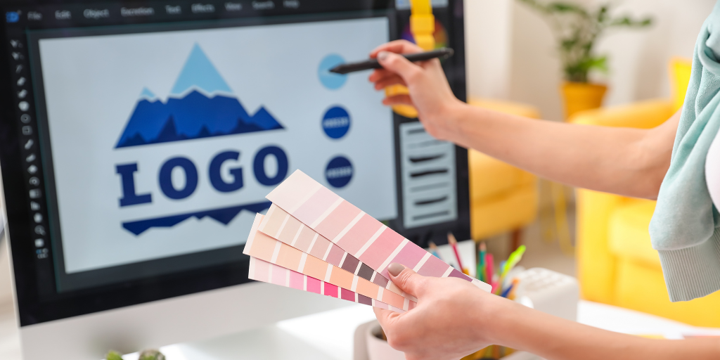
- Logo and identity design — the visual foundation of your brand
- Marketing materials — flyers, ads, email graphics, and social posts
- Website design — layout, color, and typography that guide user behavior
- Packaging — how your product looks on a shelf or in a customer’s hands
- Presentations and reports — internal and external documents that represent your brand
If you want to explore what graphic design basics look like in practice, starting with these categories gives you a clear map. Working with a professional design agency can help you apply these across all channels with consistency.
Core principles: The CRAP foundation and beyond
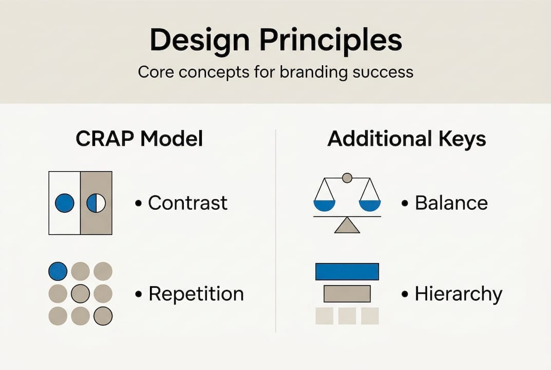
Professional designers don’t just wing it. They follow a set of principles that make their work feel intentional and effective. The most practical framework for non-designers is CRAP, which stands for Contrast, Repetition, Alignment, and Proximity. These principles of design are the backbone of almost every successful visual.
Here’s a quick-reference breakdown:
| Principle | What it does | How to apply it | Common mistake |
|---|---|---|---|
| Contrast | Makes key elements stand out | Use opposing colors or sizes for headlines | Low contrast between text and background |
| Repetition | Creates visual consistency | Repeat fonts, colors, and shapes across materials | Changing styles between pages or posts |
| Alignment | Organizes elements for clarity | Line up text and images to a grid | Centering everything by default |
| Proximity | Groups related items together | Place related content close; separate unrelated items | Spreading elements evenly with no grouping |
Beyond CRAP, three additional principles add real depth to your designs. Balance ensures no single area of a design feels too heavy. White space (also called negative space) gives your content room to breathe and makes it easier to read. Visual hierarchy guides the viewer’s eye from the most important element to the least important, in the right order.
These core design principles are not just for trained designers. Any small business owner can apply them immediately using free tools like Canva or Google Slides. The results are noticeably better, even without formal training.
Pro Tip: Before you finalize any design, squint at it. If the most important element doesn’t stand out immediately, your contrast or hierarchy needs work. This simple test catches most beginner mistakes fast.
If you want creative design solutions that already have these principles baked in, or need help with custom logo branding, working with professionals saves you the trial-and-error phase entirely.
How design drives branding and revenue
Design is not a cost center. It’s a revenue driver. The numbers back this up clearly. Design-driven companies outperform the S&P 500 by 211%, and consistent branding alone can increase revenue by 23%. These are not small gains.
Here’s a snapshot of what strong design delivers for businesses:
| Design investment | Business impact |
|---|---|
| Consistent brand colors | Increase recognition by up to 80% |
| Professional logo | Builds immediate trust with new customers |
| Cohesive social media visuals | Boosts engagement and follower retention |
| Well-designed website | Reduces bounce rate and increases conversions |
For small businesses, the path from design investment to revenue looks like this:
- Start with brand identity — logo, color palette, and typography that reflect your values
- Apply consistently — use the same visual language across every channel
- Optimize for your audience — test what resonates and refine over time
- Scale what works — once your brand feels solid, expand to new formats and platforms
The key insight here is that brand design performance compounds over time. The longer you maintain a consistent visual identity, the more recognizable and trustworthy your brand becomes. That recognition translates directly into customer loyalty and repeat purchases.
Building memorable branding doesn’t require a massive budget. It requires consistency and a clear understanding of who you’re designing for. Start with the CRAP principles, pick two or three brand colors, and stick with them everywhere.
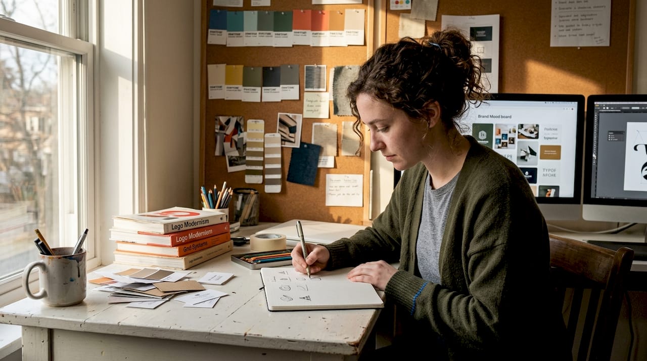
The design process: Linear approach vs. design thinking
There are two main ways professionals approach a design project. Understanding both helps you decide which fits your situation, whether you’re doing it yourself or briefing an agency.
The linear process is straightforward and efficient. It works best for simple or repeat projects like social media graphics, flyers, or branded templates. Here’s how it flows:
- Receive a brief or define the goal
- Research the audience and context
- Sketch concepts and choose a direction
- Build the design and gather feedback
- Refine and deliver the final asset
Design thinking is a more flexible, research-first approach. It’s ideal for complex branding projects, new product launches, or situations where you’re not sure what your audience actually needs. The design process explained in design thinking centers on empathy, iteration, and testing before committing to a final direction.
Here’s how they compare:
| Factor | Linear process | Design thinking |
|---|---|---|
| Best for | Simple, defined tasks | Complex or new branding challenges |
| Speed | Faster | Slower but more thorough |
| Flexibility | Low | High |
| User research | Minimal | Central to the process |
For most small business owners, the linear process works well for day-to-day design needs. Design thinking becomes valuable when you’re rebranding, launching something new, or trying to connect with a new audience. These design methodologies are not mutually exclusive. You can use both depending on the project.
Pro Tip: If you’re collaborating with a designer or agency, always start with a written brief. It saves time, reduces revisions, and ensures the final product matches your vision. Avoiding common web design mistakes starts with clear communication before the work begins.
Expert tips and common pitfalls for non-designers
Knowing the principles is one thing. Applying them without making classic beginner mistakes is another. Here’s what separates designs that work from ones that fall flat.
What to do:
- Test in one color first. A strong design works in black and white before color is added. If it doesn’t, the layout needs work.
- Maintain contrast. Your text must be readable against its background. No exceptions.
- Embrace white space. Empty space is not wasted space. It gives your message room to land.
- Stick to two fonts maximum. One for headings, one for body text. That’s it.
- Get feedback early. Show your design to someone outside your business before finalizing it.
What to avoid:
- Using three or more fonts in a single design
- Relying entirely on templates without customizing them to your brand
- Skipping the feedback step because you’re in a hurry
- Ignoring white space and filling every inch of the canvas
- Designing for yourself instead of your audience
Small businesses can apply CRAP immediately and see real improvements without needing advanced software or formal training. The fundamentals matter far more than the tools you use.
For marketing materials specifically, use hierarchy and contrast to make your call-to-action (CTA) the most visible element on the page. If someone has to search for what to do next, your design has already failed.
If you reach a point where DIY design is holding your brand back, connecting with best logo designers gives you a professional foundation to build from.
Current trends and choosing your approach
Design trends shift constantly, but two opposing philosophies dominate the conversation right now: minimalism and maximalism. Knowing the difference helps you choose the right approach for your brand.
Minimalism strips everything back to essentials. Clean layouts, limited color palettes, and lots of white space. It communicates clarity and sophistication. The risk? In a crowded market, minimal brands can start to look identical to each other.
Maximalism goes the other direction. Bold colors, layered textures, expressive typography, and visual complexity. It grabs attention and feels distinctive. The risk is looking chaotic if the underlying design principles aren’t solid.
Here’s how to choose:
- If your audience values trust, simplicity, and professionalism, lean minimalist
- If your audience responds to energy, creativity, and personality, lean maximalist
- If you’re unsure, start minimal and add personality through color and typography
“The best design trend is the one that serves your audience, not the one that’s popular on design blogs.”
The biggest shift happening in 2026 is what designers call computational aesthetics. This means creating designs that are optimized for both human appeal and machine readability, including AI systems and search engines. Your visuals need to work in alt text, structured data, and visual search, not just on a printed page.
For brands investing in digital growth, pairing strong UI/UX for startups with cohesive visual branding is the most effective combination. You can also explore branding mockup templates to visualize how your brand looks across different formats before committing to a direction. Staying current with graphic design principles ensures your work stays relevant as the landscape evolves.
Take your brand further with expert design support
You now have the principles, the process, and the trends. That’s a solid foundation. But there’s a real difference between knowing the rules and executing them consistently across every customer touchpoint.
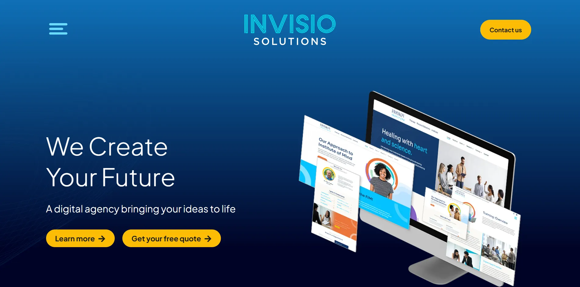
For small businesses ready to move beyond DIY, professional design support delivers results that compound over time. Our team at Invisio Solutions specializes in graphic design services built specifically for brands that want to grow. From brand identity to digital marketing visuals, we handle the details so you can focus on running your business. Our UI/UX design expertise ensures your digital presence is as strong as your brand identity. Want to see what results-focused design looks like in practice? See a design success story and find out what’s possible for your brand.
Frequently asked questions
What are the most important graphic design principles for small businesses?
Contrast, repetition, alignment, and proximity (CRAP) are the most impactful, making designs clear and memorable without advanced tools. These core design principles apply to every format, from logos to social media posts.
How does good design help my business grow?
Consistent design builds brand recognition and trust over time. Consistent branding can increase revenue by 23%, making design one of the highest-return investments a small business can make.
What’s the difference between minimalism and maximalism in design?
Minimalism uses simplicity and white space to communicate clarity, while maximalism uses bold visuals and complexity to grab attention. Minimalism can make brands invisible in a crowded market if every competitor looks the same.
Do I need expensive software to create effective designs?
No. Focusing on CRAP principles with free or basic tools is enough for most small business needs. Small businesses can apply CRAP immediately without any software expertise.
How do I know if my design works?
Test it in one color, get honest feedback from someone outside your business, and check that your main message is clear at a glance. Testing single-color logos and avoiding font overload are two of the fastest ways to catch problems early.
Recommended