
Master graphic design principles: essential guide for designers

TL;DR:
- Graphic design is a communication discipline driven by core principles like balance, contrast, and hierarchy.
- Mastering visual elements such as color, typography, and imagery enhances message effectiveness and audience engagement.
- Applying accessibility and strategic decision-making in portfolios demonstrates professionalism and creates real impact.
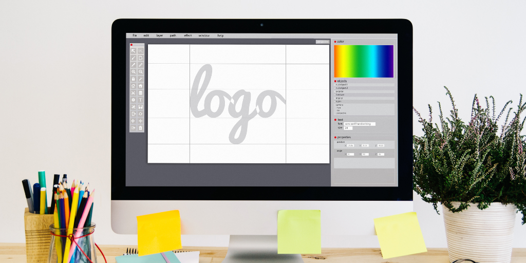
Most designers start out thinking their job is to make things look attractive. That assumption is understandable, but it misses the point entirely. Graphic design is a communication discipline, not a decoration exercise. The principles behind every strong visual, from a logo to a landing page, are what separate work that connects with audiences from work that simply fills space. When you understand and apply these foundational concepts, your designs stop being pretty and start being purposeful. This guide covers the core principles, how visual elements reinforce them, and how to apply everything to real projects that build a portfolio employers and clients actually notice.
Table of Contents
- Core graphic design principles explained
- The role of color, typography, and imagery
- Applying principles to layout and composition
- Principles in practice: Accessibility and real-world impact
- What most designers overlook: Turning principles into portfolio strengths
- Advance your skills with Invisio Solutions
- Frequently asked questions
Key Takeaways
| Point | Details |
|---|---|
| Essential principles | Mastering core design principles is the foundation for effective visual communication. |
| Practical application | Real-world design projects benefit when principles are applied to layout, color, and typography. |
| Accessibility matters | Inclusive designs enhance engagement and usability for a wider audience. |
| Portfolio value | Showcasing principle-driven work helps your portfolio stand out to clients and employers. |
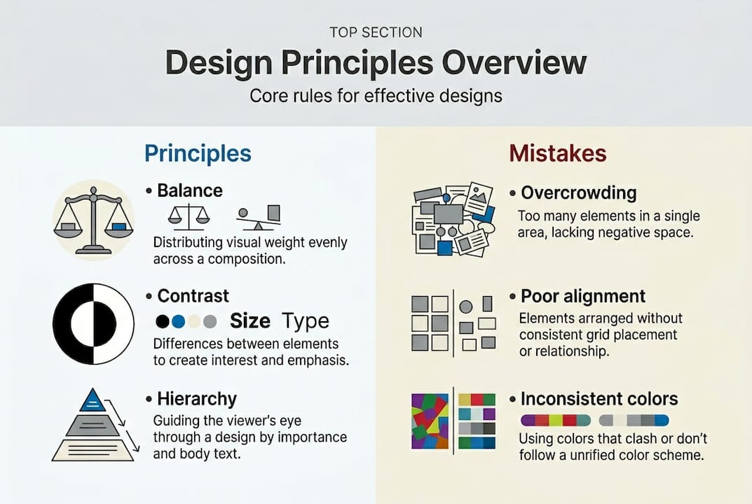
Core graphic design principles explained
Now that you understand why principles matter, let’s break down the fundamentals every designer must know. Graphic design principles are the rules and guidelines that govern how visual elements work together to communicate a message. They are not suggestions. They are the framework that makes design functional, not just visual.
Principles like balance, contrast, and hierarchy help organize information visually, giving viewers a clear path through your design. Each principle plays a specific role:
- Balance distributes visual weight evenly, creating stability. Symmetrical balance feels formal and structured. Asymmetrical balance feels dynamic and modern.
- Contrast creates visual interest and emphasis by placing opposing elements together, such as dark text on a light background.
- Alignment connects elements visually, even when they are not physically close, creating order and structure.
- Proximity groups related elements together so the viewer understands relationships without needing labels.
- Repetition reinforces visual identity by repeating colors, shapes, or fonts consistently throughout a design.
- Hierarchy tells the viewer what to look at first, second, and third, guiding attention through the composition.
- Space (also called white space or negative space) gives elements room to breathe, reducing clutter and improving readability.
These principles do not operate in isolation. A strong design uses them together. Hierarchy depends on contrast to make the most important element stand out. Proximity works with alignment to create clean, readable layouts. Repetition reinforces balance across a multi-page project.
| Principle | Primary function | Common mistake |
|---|---|---|
| Balance | Visual stability | Centering everything without intention |
| Contrast | Emphasis and readability | Too little contrast between text and background |
| Hierarchy | Attention guidance | Treating all elements as equally important |
| Proximity | Grouping and relationships | Scattering related items across the layout |
| Repetition | Consistency and identity | Inconsistent fonts or color usage |
| Space | Clarity and focus | Filling every inch of the canvas |
Pro Tip: Hierarchy is the single most powerful principle for early-career designers to master. Before you finalize any design, ask yourself: what is the first thing the viewer should see? Then make sure everything else supports that answer.
The role of color, typography, and imagery
With the fundamentals in place, designers must also master the visual elements that complement these principles. Color, typography, and imagery are not separate from design principles. They are the tools you use to execute them.
Color is one of the most immediate ways to communicate mood and meaning. Color theory, the study of how colors relate to each other and to human perception, supports contrast and emotional tone. Warm colors like red and orange create urgency or energy. Cool colors like blue and green suggest calm and trust. Using color and typography strategically means selecting palettes that reinforce your message, not just palettes that look appealing.
Common color mistakes to avoid:
- Using too many colors, which fragments visual harmony
- Ignoring color contrast ratios, which creates accessibility problems
- Choosing colors based on personal preference rather than audience psychology
- Failing to account for how colors appear on different screens or in print
Typography is where many early-career designers struggle. Choosing the right typeface is about more than aesthetics. It is about readability, hierarchy, and brand personality. Serif fonts communicate tradition and authority. Sans-serif fonts feel modern and clean. Script fonts add personality but reduce readability at small sizes. Typography and color choices are powerful tools for creating emphasis and mood, which is why pairing them thoughtfully matters so much.
“Good typography is invisible. It does its job so well that readers absorb the message without noticing the font.”
Imagery is the third pillar. The photos, illustrations, and icons you choose either reinforce or undermine your design’s message. Strong brand identity with imagery means selecting visuals that align with tone, audience, and purpose. A startup targeting young professionals needs imagery that feels energetic and authentic, not stiff or overly polished.
Pro Tip: Limit your palette to two or three primary colors per project. Add one accent color for emphasis. This constraint forces intentional choices and keeps your designs visually unified.
Applying principles to layout and composition
Choosing the right visual elements is important, but bringing them together is where principles shape effective communication. Layout is the structure that holds everything in place. Composition is how you arrange elements within that structure to guide the viewer’s eye and deliver the message clearly.

Effective layouts guide users and make information easy to absorb. Whether you are designing a poster, a brochure, or a website, the layout determines whether your audience stays engaged or moves on.
Grid vs. freeform layouts:
| Approach | Best for | Strengths | Limitations |
|---|---|---|---|
| Grid-based | Editorial, web, branding | Consistency, structure, scalability | Can feel rigid if overused |
| Freeform | Artistic, expressive work | Creative freedom, unique compositions | Harder to maintain visual order |
Most professional projects benefit from a grid foundation with selective freeform elements for visual interest. UI/UX layouts almost always rely on grid systems because they need to scale across screen sizes and maintain usability.
Here is a practical step-by-step process for building a balanced composition:
- Define your focal point. Decide what the viewer must notice first. This is your hierarchy anchor.
- Choose a grid structure. Use columns and rows to organize your content zones before placing any elements.
- Place primary elements first. Position your headline, hero image, or main message within the strongest zones of the grid.
- Apply proximity and alignment. Group related content, align elements to grid lines, and create clear visual relationships.
- Add contrast and color. Use contrast to reinforce hierarchy and color to establish mood and guide attention.
- Evaluate white space. Remove clutter. Every element should earn its place in the layout.
- Review for avoiding layout mistakes. Check alignment, spacing consistency, and hierarchy before finalizing.
This process applies whether you are working on print or digital projects. The principles stay the same. Only the medium changes.
Principles in practice: Accessibility and real-world impact
Understanding layout is crucial, but how can these principles create real, measurable impact for both audiences and clients? The answer starts with accessibility. Accessibility in design means creating visuals that work for everyone, including people with visual impairments, color blindness, or cognitive differences.
Accessible design principles improve usability for diverse audiences, and the business case for this is strong. Accessible designs increase engagement by up to 30%, which means more people interact with the content, stay longer, and take action.
Key accessibility considerations every designer should apply:
- Contrast ratios: Text must meet a minimum contrast ratio of 4.5:1 against its background for standard body copy, per WCAG (Web Content Accessibility Guidelines) standards.
- Font size: Body text should be at least 16px for digital projects. Smaller text forces users to strain, increasing bounce rates.
- Color independence: Never rely on color alone to convey meaning. Use icons, labels, or patterns as secondary indicators.
- Readable typefaces: Avoid decorative fonts for body copy. Prioritize legibility over style in functional text areas.
- Logical reading order: Design layouts so they make sense when read left to right, top to bottom, mirroring natural reading patterns.
For your portfolio impact, showcasing accessible design is a competitive advantage. Many early-career designers ignore accessibility entirely, which means demonstrating it immediately sets your work apart. Include accessibility notes in your case studies. Explain the contrast ratios you chose and why. Show that you design with intention, not just instinct.
Clients notice this. Businesses increasingly face legal requirements around digital accessibility, and designers who understand these standards are far more valuable than those who do not.
What most designers overlook: Turning principles into portfolio strengths
Here is the uncomfortable truth: most design students learn these principles in class and then treat them as theory once they start building their portfolios. They apply them instinctively, without documenting the reasoning, and then wonder why their work does not land with hiring managers or clients.
The designers who stand out do something different. They treat every principle as a decision they can explain and defend. Why did you choose that hierarchy? What contrast ratio did you use and what problem did it solve? How does the color palette support the brand’s audience?
Portfolio-ready design is not just about showing polished visuals. It is about demonstrating that you think like a strategic communicator, not just a visual artist. Clients and employers do not just want beautiful work. They want designers who can connect visual choices to business outcomes.
Pro Tip: For every project in your portfolio, write one sentence that ties your design decision to a specific audience or business goal. This single habit will make your work more memorable than 90% of what hiring managers review.
Advance your skills with Invisio Solutions
You now have a solid foundation in the principles that drive effective, communicative design. The next step is applying them in real projects that challenge your skills and build your professional reputation.
At Invisio Solutions, we work with designers and businesses to bring these principles to life across graphic design services, branding, logo creation, and online graphic design solutions. Whether you are looking to sharpen your craft, contribute to client projects, or develop your brand with graphic design, our team provides the expertise and support to help you move forward with confidence. Explore our services and see how intentional, principle-driven design creates real results for real audiences.
Frequently asked questions
What are the fundamental graphic design principles?
The most important principles are balance, contrast, alignment, proximity, repetition, hierarchy, and space. These principles work together to organize information visually and guide the viewer’s attention through a design.
How does applying graphic design principles improve my portfolio?
Following design principles makes your work more cohesive, communicative, and appealing to potential clients or employers. Strong portfolio impact comes from showing that your visual choices are intentional and connected to clear goals.
Why is accessibility important in graphic design?
Accessible design ensures your creations are usable by everyone, increasing engagement and inclusivity. Accessible design principles improve usability for diverse audiences and help your work meet modern legal and professional standards.
What is the best way to showcase design principles in my portfolio?
Present design projects with clear explanations of the principles applied and their impact on the result. Case studies that document your decision-making process show clients and employers that you design with strategy, not just style.
Recommended
- Best Online Graphic Design Services Expert Creative Solution
- Graphic Design Services London UK, Top Designers Agency UK
- Graphic Design Services | Your Brand With Invisio Solutions
- Mastering Web Design: 8 Common Pitfalls Their Solutions
- Priprava dizajna za tisk: koraki za kakovostne tiskane izdelke 2026