
In today’s digital landscape, every website has its own unique requirements and objectives. Whether it’s an online retail store or a law firm, the features needed vary significantly. For instance, an e-commerce site selling clothes must prioritise inventory control to ensure products are always in stock. Conversely, a law firm that doesn’t engage in online product sales won’t benefit from this feature. However, regardless of specific needs, there is one crucial aspect that all websites must prioritise for success: responsive design and mobile friendliness.
The field of web development and design faces a daunting challenge in keeping up with the constant influx of new devices and screen resolutions. Creating a separate version for each new device is not only impractical but also impossible. Yet, neglecting to optimise a website for specific devices can result in a significant loss of visitors. From smartphones and tablets to PCs and TVs, people interchangeably use these devices throughout their buying process. For example, someone might browse headphones on their phone during their commute and make the actual purchase on their laptop at home, a few days later.
With the global surge in smartphone usage, the importance of responsive web design cannot be overstated. However, before delving into the significance of web design responsiveness, let’s understand what responsive web design truly entails.
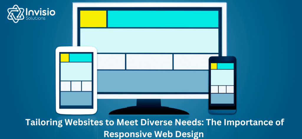
Responsive web design adopts an approach that suggests websites should adapt to user behaviour and environment, encompassing factors like screen size, platform, and orientation. It leverages flexible layouts, grids, and images to seamlessly transition between different devices. When a user switches from a laptop to a tablet, the website should automatically adjust to accommodate the variations in image size and resolution between the two devices.
Responsive design eliminates the need for separate designs for each device in the market, allowing websites to respond to user preferences. For example, a wider display can facilitate browsing with multiple columns, while a smaller screen would present the same content in a single column with appropriately sized elements and links.
Mobile devices, particularly smartphones, have become the primary gateway for users to experience the web. Consequently, having a responsive website has become more critical than ever. Pelling Design, a prominent web design agency, highlighted the significance of responsive design in their article “Is Your Business Prepared for the Mobile Browsing Revolution,” emphasising that optimised responsive design should be at the top of any business’s wish list.
Responsive design extends beyond providing a consistent experience on smartphones alone; it encompasses optimising websites for all screens. Therefore, businesses seeking to enhance their web design’s responsiveness should focus on simpler layouts and streamlined experiences.
Let’s explore the benefits of implementing responsive web design:
#1. Supporting multi-device users: ensuring a seamless and consistent experience for users across devices, enabling them to access the same information regardless of the device they use.
#2. Easier website management: With a responsive website, there’s no need to maintain or update multiple versions, streamlining maintenance efforts.
#3. Improved search engine ranking: Google, the search engine giant, recommends responsive web design as it supports different devices and screen sizes. Over 50% of Google searches are now conducted on mobile devices.
#4. Future scalability: Responsive sites, being fluid in nature, can easily scale up or down to fit various screens. Businesses with a responsive site can efficiently adapt to new devices with designs optimised for different screen sizes.
#5. To ensure a responsive web design that provides a superior user experience across multiple platforms, keep these four core principles in mind:
#6. Eliminate unnecessary content or code: Remove redundant elements while retaining essential functionality, such as product pages and navigation menus.
#7. Design with mobile in mind: prioritise mobile-friendly design, starting with the smallest screen size and gradually expanding.
#8. Prioritise an intuitive user interface: simplify user interfaces, as complex features and rich media may not translate well to smaller screens. Consider factors such as element placement, size, and adhering to established standards.
#9. Embrace intuitive web design principles: Utilise grid layouts, aligned page tabs, left-to-right page layouts, and other intuitive design elements to enhance the user experience. An intuitive website should prioritise easy navigation, comprehensive content, speed, reliability, and consistency with the brand’s identity.
The Development Process of a Responsive WordPress Design
Step 1. Planning and Strategy:
A responsive WordPress design begins with thorough planning and strategy. This stage involves understanding the business’s goals, target audience, and desired functionalities. Identifying key features, content hierarchy, and design elements is crucial. Collaborating with clients to gather their requirements and align them with the intended user experience forms the foundation for a successful project.
Step 2. Wireframing and Design:
Once the planning stage is complete, the next step is wireframing and design. Wireframes provide a visual representation of the website’s structure, layout, and content placement. They allow for early feedback and ensure that the design aligns with the client’s vision. Once the wireframes are approved, the design phase begins, where the visual elements, typography, colour scheme, and branding elements are incorporated to create an appealing and cohesive design.
Step 3. Development and Implementation:
The development phase involves converting the approved design into a responsive WordPress theme. Skilled WordPress developers utilise HTML, CSS, and JavaScript to transform the design into a functional and interactive website. They employ responsive techniques such as fluid grids, flexible images, and media queries to ensure the site adapts seamlessly to different screen sizes. Integrating necessary plugins, optimising page speed, and ensuring cross-browser compatibility are vital aspects of this stage.
Step 4. Content Integration and Customization:
With the foundation of the responsive WordPress design in place, the next step is content integration and customization. Skilled developers work closely with clients to migrate existing content or create new content. They ensure that the content is optimised for search engines and aligns with the responsive design. Customization includes adding features, functionalities, and plugins that enhance the user experience and cater to the specific needs of the business.
Step 5. Testing and Quality Assurance:
Thorough testing and quality assurance are indispensable to delivering a flawless responsive WordPress design. Developers rigorously test the website across multiple devices, browsers, and screen sizes to identify and rectify any bugs, glitches, or responsiveness issues. They ensure that the design is intuitive, navigation is seamless, and all functionalities work correctly. Additionally, they conduct performance testing to optimise loading speed and responsiveness.
Step 6. Launch and Ongoing Support:
Once the website has undergone comprehensive testing, it is ready for launch. Experienced WordPress development agencies provide support during the launch process to ensure a smooth transition. They handle tasks such as domain setup, hosting configuration, and website migration. Post-launch, ongoing support and maintenance are vital to keeping the website secure, updated, and running smoothly. Expert agencies offer regular backups, security monitoring, and technical support to address any issues that may arise.
Why Hire an Expert WordPress Development Agency?
Advantage 1. Professional Expertise:
Building a responsive WordPress design requires a deep understanding of WordPress development, responsive design principles, and industry best practices. Expert WordPress development agencies have a team of skilled professionals who possess the necessary expertise to deliver exceptional results.
Advantage 2. Customization and Scalability:
Expert agencies can tailor the responsive WordPress design to match the unique requirements and branding of a business. They can incorporate custom features, functionalities, and plugins that enhance the user experience and meet specific business needs. Moreover, they ensure that the design is scalable, allowing for future updates and expansions.
Advantage 3. Time and Cost Efficiency:
Attempting to develop a responsive WordPress design without expertise can lead to time-consuming and costly mistakes. Hiring professionals streamlines the process, saving time and reducing the risk of errors. Moreover, expert agencies can work within a predefined budget, providing cost-effective solutions without compromising quality.
Advantage 4. Quality Assurance and Support:
Professional WordPress development agencies have robust quality assurance processes in place to ensure that the responsive design meets the highest standards. They conduct thorough testing and provide ongoing support to address any issues promptly. This ensures a seamless user experience and minimises disruptions.
Advantage 5. Focus on Core Business:
Outsourcing the development of a responsive WordPress design allows businesses to focus on their core competencies. Instead of navigating the complexities of WordPress development, business owners can concentrate on strategic initiatives while leaving the technical aspects to the experts.
In conclusion, responsive web design offers numerous benefits, including low maintenance, versatility, and a seamless user experience. To stand out in the online landscape, it is advisable to consult a professional graphic design agency that can help create a unique, intuitive, and responsive website tailored to your business needs.