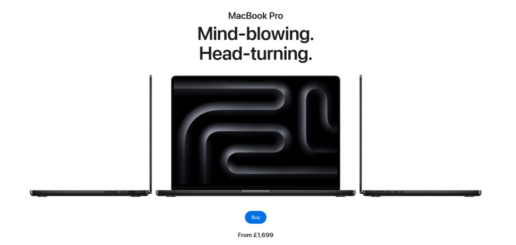
Design: Clean, minimalist design, with high quality 3D moving images and unique elements.
Content: Clear and concise messaging, product-focused content, with highlights (e.g.: “The most advanced chips ever”), history and technological aspects. Messages are targeting some targets group directly, e.g. gamers with: “Games will look more detailed than ever”.
Call-to-action: Strong call-to-action – “Buy” button is in a very prominent place and clearly stands out. Once clicked the navigation through buying process is extremely straightforward and clean.
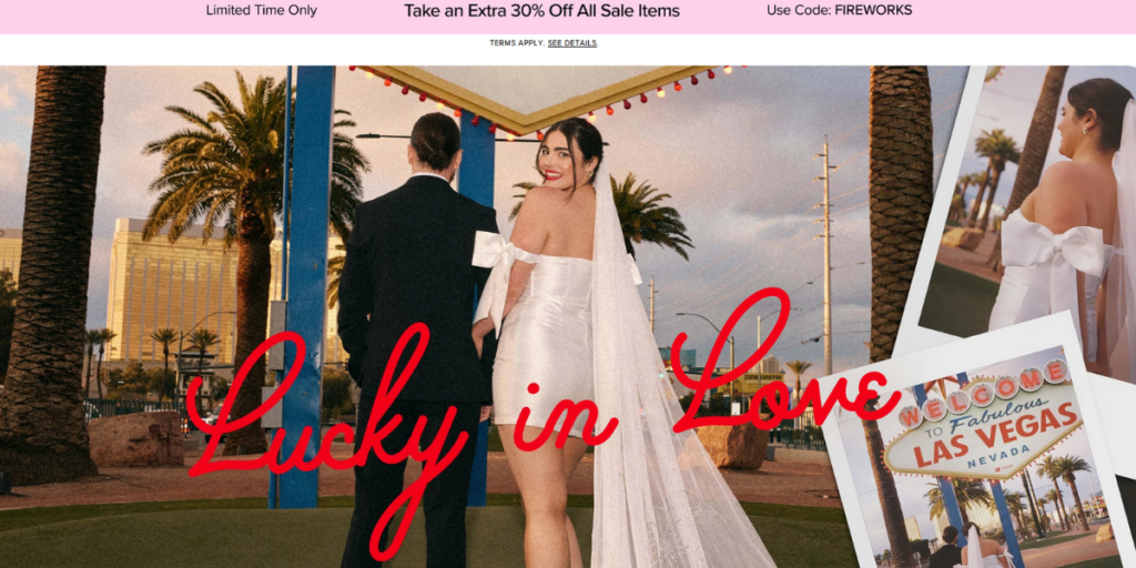
Design: Aspirational and romantic atmosphere.
Content: layout effectively highlights different product categories making it easy for users to focus on their area of interest. Navigation through the web page is extremely easy and aesthetic.
Call-to-action: The banner at the top offers an extra 30 % off all sale items for a limited time, providing a clear incentive and sense of urgency for visitors to take immediate action. The call-to-action button, “Shop Wedding Dresses,” is clearly visible and directly below the main message, making it easy for visitors to know what action to take next.
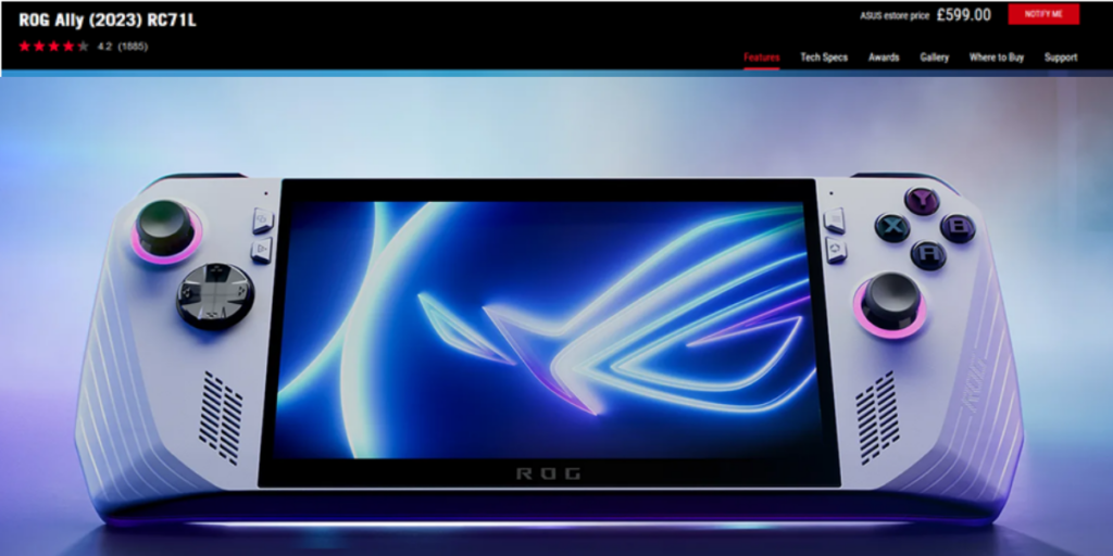
Design: sleek and modern, with a high-quality image and typical colour scheme for gaming products.
Content: key selling points, such as the high customer ratings (4.2 stars), reviews and price are prominently displayed. Navigation bar includes introduction, performance, design and technological aspects, offering comprehensive information available to potential buyers.
Call-to-action: The “Notify Me” button at the top right corner serves as the primary call-to-action, prompting visitors to sign up for notifications about availability, which suggests exclusivity and urgency.
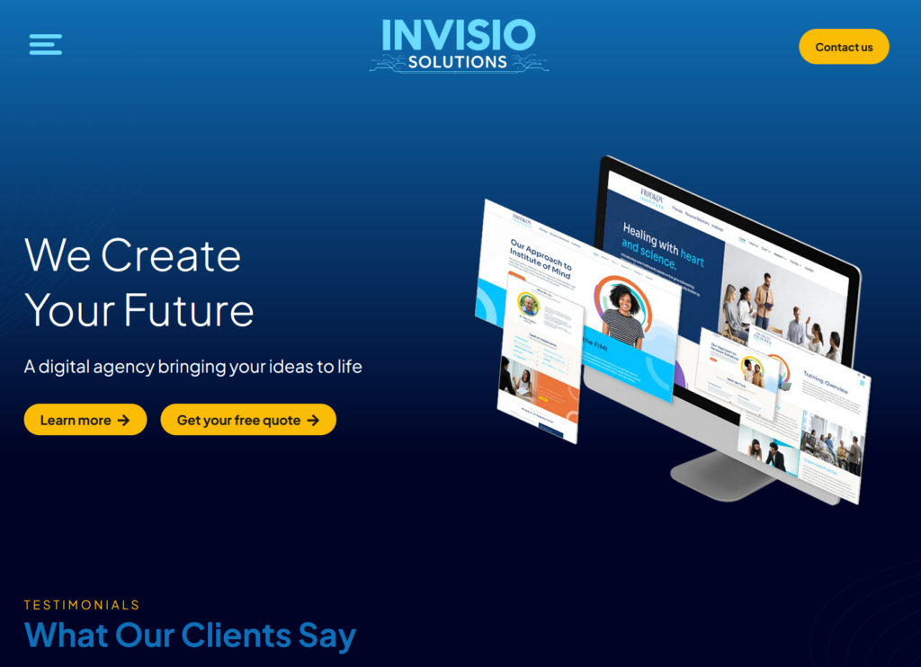
Design: modern, with a clean layout and a harmonious color scheme fitting for a digital agency. The font is clean and easy to read, with a hierarchy that helps guide the viewer’s eye from the headline to the subheadline and then to the CTA buttons.
Content: The headline “Building solutions that win you more clients” is strong and directly addresses the main benefit of the agency’s services. The supporting text elaborates on the agency’s mission, approach, and expertise. Client testimonials are added to convince of excellence.
Target group: The primary target group is business professionals looking for reliable and innovative digital agency services, including web design, digital marketing, and branding.
Call-to-action: There are two clear and prominent CTA buttons: “Learn more” and “Get your free quote.” This dual approach caters to different stages of the customer journey—those seeking more information and those ready to engage with the service.
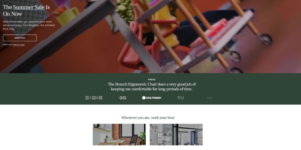
Design: vibrant and modern, using attention grabbing high-quality video.
Content: The headline “The Summer Sale Is On Now” immediately grabs attention and creates urgency. Mentions in the press add credibility to the firm. The firm’s lower prices are explained with neat-looking statistics and graphs.
Call-to-action: The “SHOP NOW” button is prominently displayed, encouraging immediate action. “Design my office” button adds more personal approach to marketing.
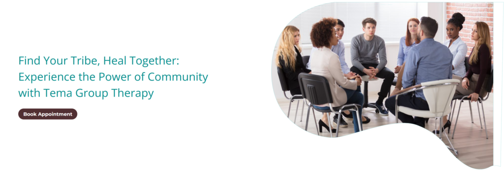
Design: calming color scheme of teal and white creates a welcoming and peaceful atmosphere. The layout is straightforward and well-organized, making it easy for visitors to understand the main message and navigate the page.
Content: The headline “Find Your Tribe, Heal Together: Experience the Power of Community with Tema Group Therapy” is engaging and inviting, emphasizing the communal and supportive nature of group therapy. Available therapists are listed with pictures, specialties, and education, making it easy for visitors to form a connection with potential therapists, facilitating the booking of an appointment.
Call-to-action: The “Book Appointment” button is clear, direct, and action-oriented. It stands out with its contrasting color, making it easily noticeable.
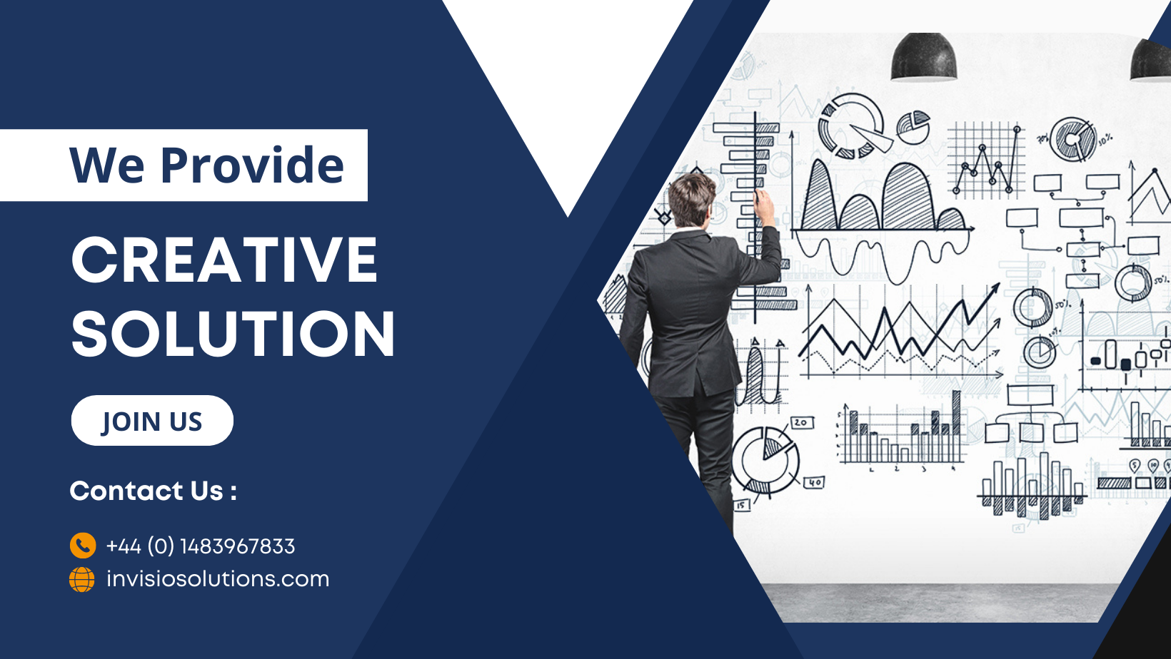
Want a clean looking landing page with great conversion rates? Book Invisio solutions.